Maintaining consistent elements of style in a user-interface is an important aspect of programming which should not be overlooked. An extremely powerful application will have its usefulness compromised by an interface that is unlike the majority of other applications a user will be exposed to.
In an effort to create a more standardized method of application programming, this reference will diagram many interface elements that every Atari programmer should use, regardless of whether you are applying them to existing parts of GEM or programmer-defined elements.
In a case where you provide an enhanced interface element that departs from these specifications, you should at least allow the user to disable the option in a 'Settings...' dialog.
All GEM applications should contain a menu bar providing access to program features. Desk accessories should appear in a window.
'Dialogware' and 'Alertware' applications are strongly discouraged. Each performs user interaction exclusively in one or more dialogs or alerts respectively. This makes it impossible for the user to take advantage of other programs or desk accessories while in use.
Document-oriented applications that are launched with one or more valid documents specified on the command line should launch those documents into their own windows, otherwise the application should initialize in one of two other ways:
Open an empty document window with the default parameters labeled "Untitled."
Present a dialog allowing three choices. "New" opens a blank document (as above), "Open" presents a file selector used to select a document to open, "Cancel" removes the dialog and leaves the user with the menu bar to make other selections.
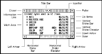
Normal document windows should have a title bar and should be moveable (these characteristics are set with the wind_create() function - see Chapter 6: AES ). The following illustration shows a window with all window components identified:

Here are some other basic rules to use when creating windows:
Windows should almost always have the MOVE characteristic set.
If it is possible that the contents of the information displayed in the window might overflow, provide sliders (horizontal and/or vertical) as appropriate. The sliders should be updated as necessary to ensure that they are proportional in size and position to the amount of information viewable in the window versus the size of the entire document.
Generally, all document windows will include all window elements (with the possible exception of the information line). Only exclude an element if its use would be inappropriate in the current context.
An application's use of windows depends on either the evnt_mesag() or evnt_multi() functions of the AES. These functions return messages which in turn must be responded to by the application for any changes to occur. The following list illustrates all messages that a window may receive along with an appropriate action(s) that should be taken.
|
|
Action |
|---|---|
| WM_REDRAW | Redraw the rectangular portion of the window which was dirtied (as specified in the message). Always use wind_get() with WF_FIRSTXYWH and WF_NEXTXYWH to walk the rectangle list and enable clipping to the appropriate regions.If the window had a SMALLER gadget, check prior to drawing whether you are drawing the actual window contents or an iconified representation.If the window has an attached toolbar that requires special redrawing, use wind_get() with WF_FTOOLBAR and WF_NTOOLBAR as parameters to walk the rectangle list and enable clipping to the returned regions.In some situations you may want to redraw the entire window upon each WM_REDRAW call. You must still walk the rectangle list as specified above. |
| WM_TOPPED | Call wind_set() with a parameter of WF_TOP to actually top the window. Do not redraw the window. Your application will receive WM_REDRAW messages for portions of the window uncovered by the call.Also, set the mouse form as desired. |
| WM_SIZED | Call wind_set() with a parameter of WF_CURRXYWH to actually change the current size of the window. Update slider positions as necessary to reflect the new size of the window.Applications will automatically receive a redraw message if any portion of the window was uncovered. If you need to redraw the entire window each time the window size changes, send your own application a WM_REDRAW message with appl_write() to cause a redraw. |
| WM_MOVED | Call wind_set() with a parameter of WF_CURRXYWH to actually change the current size of the window. This message and the message WM_SIZED are usually handled by common code. |
| WM_ARROWED | Scroll the contents of the document window as necessary and redraw the window (using the rectangle list).When an arrow indicator is clicked, scroll the window by one 'line' (a small increment in a non-text oriented application). When the exposed area of the slider bar is clicked, scroll the contents of the document window by one 'page' (current viewable portion of the document) minus one 'line'. |
| WM_VSLID | Scroll the contents of the document window in proportion with the new position of the slider elevator. |
| WM_HSLID | Scroll the contents of the document window in proportion with the new position of the slider elevator. |
| WM_FULLED | Restore the size of the window using wind_get() with a parameter of WF_PREVXYWH. Update slider bars as necessary. |
| WM_CLOSED | Close the window. If the window context required a positive or negative answer from the user ('Yes/No' or 'OK/Cancel'), assume positive. If the window contains a document which has been altered since the last time it was saved to disk, it is appropriate to ask the user if the document should be saved before proceeding. |
| WM_BOTTOMED | Call wind_set() with a parameter of WF_BOTTOM to send the window to the bottom of the window stack. |
| WM_ICONIFY | See below. |
| WM_UNICONIFY | See below. |
| WM_ALLICONIFY | See below. |
| WM_TOOLBAR | Respond as necessary to the toolbar event. |
| WM_ONTOP | Set the mouse form appropriately for your application. |
| WM_UNTOPPED | No action is mandated by this message. |
In every instance where text or graphics are rendered in a window, you should walk the rectangle list in order to ensure that the screen is properly updated. This includes all instances when the contents of the window are updated as a response to a user command (as opposed to a WM_REDRAW message) or dynamic interaction (i.e. selection or animation).
The title bar of a window should accurately reflect its basic contents. If a window contains a document the title bar should contain the filename of the document or 'Untitled' if it is a new document that has not been saved yet. If the window does not contain a document, the title bar should serve to clearly explain the purpose of the menu. For example, if you were to implement a find and replace dialog in a window, the window should be titled "Find & Replace."
In some cases you may wish to provide an option (though a menu or keystroke) which allows the user to open a duplicate copy of the document in another window. This allows the user to select separate views in each open window yet changes in one window are reflected in others. In this case, suffix the document name with a colon and the window number such as "FILENAME.DOC:1". The numbering should only be present when more than one document window actually exists.
AES versions 4.1 and above support the SMALLER gadget for window iconification. The basic rules for iconification follow:
| Action |
|
Response |
|---|---|---|
| User wishes to iconify a single window. |
|
Iconify the single window. |
| User wishes to iconify a single window. |
|
Close the window the user wishes to iconify and add it to those represented by the 'program group' window. |
| User wishes to iconify all windows. |
|
Create a new, iconified window as a 'program group' and close all other windows. |
| User wishes to iconify all windows. |
|
Add all open windows to those represented by the 'program group' window and close all other windows. |
| User wishes to uniconify a single window. |
|
Uniconify the window. |
| User wishes to uniconify a 'program group' window. |
|
Close the iconified window and open all of the windows in the 'program group'. |
Here are some other hints that are helpful when dealing with iconification:
Due to the smaller size of the window title line, it may be desirable to adjust the title text when a window is iconified.
Draw an icon which represents the contents of the window when drawing a single iconified window. When drawing a 'program group' iconified window, draw an icon which represents the application.
Use graf_growbox() and graf_shrinkbox() to graphically show the user the iconification/uniconification process.
When appropriate, the addition of the INFO component of a window should serve to provide additional information about the objects visible in the window. This information should change to provide the most useful information. A vector graphics editor might display the document size, statistics, and zoom factor normally, but provide information on the number and extent of selected objects when at least one object is selected.
AES versions 3.0 and above allow the color of each window component to be modified. An application should never modify the global settings. Allow the user to use the Window Colors CPX to choose global colors of his/her choice.
If your application wants to draw a visual distinction between windows by displaying them in different colors, provide a dialog where the user may choose color preferences or (at least) enable/disable this option.
Prior to drawing a dialog and calling form_do(), call the AES function wind_update( BEG_UPDATE ). Do not release control with END_UPDATE until the dialog box is removed and input with it is finished.
If a dialog box controls a physical attribute (such as text face or fill type), provide a 'Sample' area where changes are automatically displayed prior to exiting the dialog.
Dialogs that position themselves automatically at the center of the active window or mouse location are convenient to some users, annoying to others. When providing this feature, allow it to be disabled.
Buttons should always appear in the order 'OK', 'Cancel', ...other buttons..., 'Help' when working left to right or top to bottom. 'OK' should be in all capitals. All other buttons should be capitalized. When other wording is appropriate (such as 'Yes/No') the positive answer should always precede the negative answer.
All dialogs should have a default exit button which exits the dialog. In most cases this will be the positive 'OK' or 'Yes' response. In a case where an action is irreversible and data will be changed (for example, formatting a disk), it is appropriate for the negative response to be made default rather than the positive one.
Exit buttons should be placed in a dialog so that they are either centered at the bottom of the dialog or listed from top to bottom starting at the upper-righthand corner of a dialog as pictured in the following diagrams:
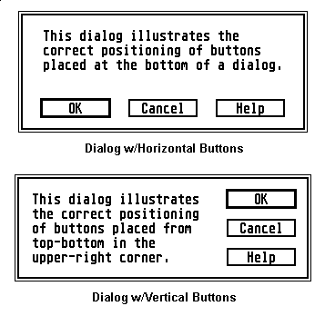
When using the 'top-down' style, buttons with complementary meanings may be grouped by inserting one space between groups. The dialog pictured above shows an example of a dialog with an 'OK', 'Cancel', and 'Help' button correctly positioned.
In some cases a dialog may contain features for both the common and advanced user. In this case it is recommended that an 'unfolding' dialog be presented.
An unfolding dialog contains a button such as 'Options >>' or 'More >>' which, when pressed, expands the dialog to reveal additional features. When this happens the 'Options >>' button becomes '<< Options' (or 'More >>' becomes '<< Less' which, when pressed, will return the dialog box to its original state.
In general apply rules regarding button text (such as capitalization, the default object, etc.) to alerts.
Whenever possible, provide the user with more than one option in an alert box. Alerts with only one button are frustrating and should only be used when only one possible course of action exists.
Never provide an 'OK' button and a 'Cancel' button when either button will lead to the same action/inaction.
Avoid using the word 'error' or any other text which might blame the user.
If an error has occurred, suggest a remedy (possibly using a dialog box for data reentry).
Use 'Cannot' instead of 'Can't' or 'Can not'.
If an error alert might occurring during multi-tasking while another process has focus, make the first line of the alert text the program name followed by a colon.
A message such as "Not enough memory to load file TEST.DOC." is much better than "Insufficient memory."
Minor warnings to a user might become increasingly apparent by having the response to the first incorrect action be the system bell and the second occurrence being a dialog box politely guiding the user along.
Message text should be left-aligned.
If message text is too long to fit into the 5 line/30 character per line limit, consider downsizing the message for clarity, or if necessary, place the alert in a form. Never use consecutive alerts.
Alerts should be capitalized by standard grammatical rules and should be punctuated with a period or question mark (not an exclamation mark).
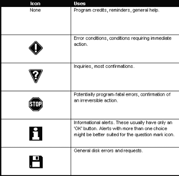
Alerts boxes may be displayed with one of three icons (or no icon at all). The following lists examples of when to use a specific icon:
|
|
Uses |
|---|---|
|
|
Program credits, reminders, general help. |
| Error conditions, conditions requiring immediate action. | |
| Inquiries, most confirmations. | |
| Potentially program-fatal errors, confirmation of an irreversible action. | |
| Informational alerts. These usually have only an 'OK' button. Alerts with more than one choice might be better suited for the question mark icon. | |
| General disk errors and requests. |
If you commonly use a third-party replacement file selector on the system you test applications on, always test your application with the replacement file selector disabled. Several third-party file selectors handle screen redraws and pathname parsing differently than the internal file selector does.
When your application needs to display the file selector, always ensure that the pathname that is going to be passed to the file selector call is valid. If the pathname becomes invalid, revert to a system default path such as that of your applications own. It is also courteous to the user to store the last used path in a global buffer so that each time the file selector is accessed the user doesn't have to change directories again.
If your application requires that its files be loaded and saved with a specific file extension, append that file mask to the end of the pathname so that the user's choices are restricted. If during a save operation the user chooses to override your default extension, either allow it or prompt the user as to their true intention.
When the file selector call returns, if the filename field is blank, treat it as a 'Cancel'. If a filename was entered but it contains no file extension, append your default file extension (if appropriate) to it.
When an application begins a task that may require a substantial amount of time to complete, it is normally appropriate to change the mouse to a BUSY_BEE form to indicate to the user a long action is taking place.
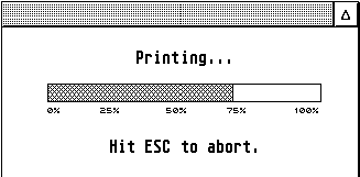
If the screen display does not reflect the actual task in real time, it is helpful to display a progress bar (sometimes referred to as a thermometer) indicator on screen to remind the user that an task is indeed taking place and that the computer has not entered a locked state. In this case, you may leave the mouse form in the ARROW shape so that the user may perform other functions in a multitasking environment.
It is helpful to place a progress bar for potentially long operations into a window so that other applications or desk accessories may be accessed. When possible, the exact length of the operation might be stated like "Time Left: xx:xx".
The progress bar should move as closely as possible to a true proportional representation of time (i.e. avoid circumstances where it might take ten seconds to move from 25% to 50% but only a second to move from 50% to 100%).
An example progress bar showing a task in progress is shown below:
Buttons on these specialized dialog/window combinations fall into three categories, exclusive buttons (such as a pointer tool and rectangle tool), non-exclusive buttons (such as zoom on/off), and style buttons (such as fill style and line style).
Buttons should reflect their state by appearing either inverted or depressed. The currently selected exclusive button as well as any selected non-exclusive button retains this state until a new object is chosen or it is deselected. Style buttons are only selected until the user has completed the operation. When available, toolbox buttons should appear in color using a G_CICON. An example of a toolbox window follows:


Newer versions of the AES provide built-in support for toolbars, though they can be implemented in applications running in an OS that does not support the new calls.
The leftmost menu title (commonly referred to as the 'Desk' menu) should be the application name. An example of the first menu title/items are shown below:
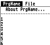
The first item in the menu should be "PRGNAME...". PRGNAME should be substituted with the name of the application. The lines below are reserved for desk accessories and applications (when running under MultiTOS)..
An application should call menu_register() (under MultiTOS) to change its entry in the menu from the filename to the program title.
The second and third menu titles should be "File" and "Edit" as appropriate (though the inclusion of both of these menus is highly recommended). Application defined menus should be placed after these. If a "Help" menu is available it should be the rightmost title. A "Window" menu should be placed rightmost second only to "Help" if it exists. An example title bar follows:

Menu entries should be grouped by function under appropriate titles and subgrouped by placing separator bars between them (disabled dashes).
Menu entries which end in an ellipsis should lead to a dialog box. Those without ellipsis should carry out an action with no further user interaction.
The "File" menu should consist of the following items (presented in order):
New
Open...
Recall (optional - has cascading menu attached with most-recently used file list)
Save
Save as...
Save all (optional)
Any other document closing commands as required.
Separator
Import (if applicable)
Export (if applicable)
Any other file operations as required.
Separator
Page Setup... (if applicable)
Print (if applicable)
Any other printing commands as required.
Separator
Quit
Following is an example "File" menu:
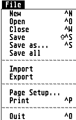
The next menu, "Edit", usually contains the following items:
Undo (if supported)
Redo (if supported)
Separator
Cut
Copy
Paste
Delete
Separator
Select All (optional)
Separator
Find... (optional)
Replace... (optional)
Find Next (optional)
Separator
Any other editing/searching commands.
An example "Edit" menu follows:
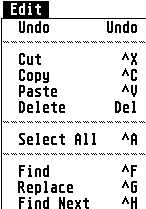
Apply a checkmark to the item to indicate an enabled state.
Alter the text. For example, when "Hide Toolbar" is clicked, change the text to "Show Toolbar".
In addition, some menu item groups may provide a choice between more than two options.
Again, checkmarks can be used to indicate the selection.
Here are some other general pointers about using menus:
Menu items such as "Preferences..." or "Save Preferences" belong in the "Options" menu.
Menu items for text styles (like bold, italic) can be made G_USERDEF objects and made to reflect their actual state.
If you add a "Window" menu, items such as "New Window" which opens a new window for the current document, "Arrange All", "Tile All", "Cascade All", which positions windows can optionally be included. Followed by a separator, a generic item "Window" can be attached to a cascading menu which contains an updated list of all document windows so that the user can use the menu bar to 'top' a window.
If you add a "Help" menu, different options can provide different levels of help such as "Contents" or "Index". Don't list help items for each possible dialog box or mode, instead provide context sensitive help that is activated through a "Help" button or by pressing the HELP key.
Popup menus can also be placed in dialog boxes as shown below. Dialog objects which lead to popup menus should be TOUCHEXIT and SHADOWED. If text describing the popup appears at the left of the button, it should be inverted when the popup is displayed and until it is closed.
When a popup menu contains a list of exclusive options, the option currently selected should be properly identified to the menu_popup() command so that it is aligned with the object in addition to having a checkmark. Popups with no selected option should always start at the first selection.
Popup menus may contain objects other than text (like fill styles or bitmaps) but will be unable to scroll.
Drop-down list boxes are handled in the same manner as popup menus with the following exceptions:
An 'equivalence' character (ASCII 240) in a BOXCHAR object should be displayed immediately to the right of the box leading to the drop-down list and should also be TOUCHEXIT and SHADOWED. A click on this object is the same as clicking on the main object.
No checkmark should be displayed next to the current selection.
The TOUCHEXIT box leading to a drop-down list may be editable, if appropriate, to allow the user to add items to those currently in the list.
The following illustrations show examples of both a 'closed' (prior to being selected) and 'open' (during selection) drop-down list:
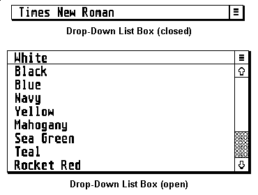
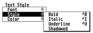
The following keyboard equivalents are universal among many platforms (including Atari) and should be enabled in all cases where a counterpart option exists in an application. Other keyboard equivalents may be assigned as long as they do not conflict with one of those already predefined. The use of the ALTERNATE key as a modifier in a keyboard equivalent is discouraged because international users use the ALTERNATE key to access special keyboard characters.
Menu keyboard equivalents should be notated next the menu item and flush right (excepting one space) with the menu. The CONTROL key should be notated by the caret, the ALTERNATE key should be notated by the window closer character, and the SHIFT key should be notated by the up arrow character. Function keys are notated "Fnn" and other keys are notated as, for example, "Del", "Bksp", "Help", etc.
Menu items with a sub-menu attachment should not have a keyboard equivalent. An example menu with keyboard equivalents shown correctly follows:
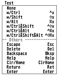
Following is a list of defined keyboard equivalents:
| Key Equivalent | Operation |
|---|---|
| ctrl-n | New |
| ctrl-o | Open |
| ctrl-w | Close |
| ctrl-s | Save as... |
| ctrl-shift-s | Save |
| ctrl-p | |
| ctrl-shift-p | Page Setup |
| ctrl-q | Quit |
| ctrl-x | Cut |
| ctrl-c | Copy |
| ctrl-v | Paste |
| ctrl-a | Select all |
| ctrl-f | Find |
| ctrl-r | Replace |
| help | Access help |
| shift-help | Engage context sensitive help. Pointer should change to arrow/question mark and help should be provided for any object clicked on. |
| undo | Undo last operation |
When working with text-oriented applications, the following list of keyboard equivalents apply. Keep in mind that CTRL is generally a character-based modifier while SHIFT is line-based.
| Key Equivalent | Operation |
|---|---|
| ctrl-b | Bold |
| ctrl-i | Italic |
| ctrl-u | Underline |
| ctrl-backspace | Delete word to left. |
| ctrl-delete | Delete word to right. |
| ctrl-arrow | Move to the left/right one word. |
| ctrl-clrhome | Move cursor to start of document. |
| shift-left-arrow | Move to the beginning of current line. |
| shift-right-arrow | Move to the end of current line. |
| shift-up-arrow | Move up one page. |
| shift-down-arrow | Move down one page. |
| shift-delete | Delete line. |
| shift-clrhome | Move cursor to end of document. |
| arrow | Move one character left/right. |
| clrhome | Move cursor to top of window. |
| backspace | Delete character to left of cursor. |
| delete | Delete character to the right of cursor. |
When working with object-oriented applications, the following keyboard equivalents are suggested:
| Key Equivalent | Operation |
|---|---|
| arrow | Deselect current object(s), select previous/next object. |
| backspace | Delete selected object. |
| delete | Delete selected object. |
| tab | Deselect current object, select next object. |
When in the context of a text-editing application, SHIFT-clicking on a point should select the text from the cursor position to the point clicked or add that region to a current selection (if one exists). In an object-oriented application, SHIFT-clicking should allow the user to select and deselect multiple objects.
Programming for compatibility on the Atari is a simple task. Here are some basic tips:
A GEM program should use the VDI for all graphical/screen output. Never use GEMDOS, BIOS, or XBIOS functions to output to the screen or manipulate the palette.
Don't make assumptions about the type of display based on any call such as Getrez(), EsetShift(), or Vsetmode(). Only look at the values returned by the VDI v_opnvwk() call.
For printing, always support GDOS. It is the only way to ensure that a user has a printer driver and fonts for the attached printer and that output is consistent among different printers. As with the screen, never make assumptions about the printer based on criteria like driver name, etc.
Never write directly to hardware unless it's the documented way to accomplish a task. This is an almost sure sign that your program will break in future hardware releases.
Avoid using interrupt vectors. If you must use them, use Setexc().
An application's proper use of color can greatly enhance its effectiveness. Likewise, improper use of color can thoroughly confuse a user. Below are some basic rules about the use of color:
Never alter the first 16 colors in modes with 256 colors or more. Only change system colors in other cases when absolutely necessary. These are system colors which should be controlled exclusively by the user.
When providing a custom 3D effect to complement the OS under TOS 4.0 and above, use objc_sysvar() to interrogate color settings to allow your objects to match.
Make dialogs FL3DBAK objects to allow the user's selected dialog color to come through.
Don't use colors to decorate, use them to emphasize or draw attention to an important screen element. Use colors to display choices relating to color or when a user expects it in the document.
When using color as a choice indicator, use green as a positive, red as a negative.
As with color, the proper use of sound can help or hinder an application program. The system bell should be used as a polite reminder to the user when an operation is being attempted that is beyond the capabilities of the application (ex: scrolling past the last line in a document). It is also useful to alert the user to the end of a long operation (during which the user might have stepped away).
In general, applications should restrict their use of sounds to the system bell. Beyond that, applications can support sounds through the use of the accessory "System Audio Manager" (supplied with the Falcon030) or have their custom sounds provided they may be enabled selectively by the user.
Provide an installation program on the distribution floppy called 'INSTALL.PRG'. See below for details.
Use the '_IDT' cookie to determine the proper method of displaying dates and times. Use the '_AKP' cookie to determine the country's currency character.
Provide help in as many places as possible. Provide context-sensitive help if possible.
Entertainment software written for Atari computers should follow these minimum standards.
Allow the user to install your software on the hard drive using an 'INSTALL.PRG'.
Don't force the user to change resolutions prior to running your software.
The path to your application should not contain data files, place those in a folder.
Allow the user to return to the desktop in the same resolution he left.
If possible, allow the game to be run in a window.
Use device-independent graphics paired with the VDI call vr_trnfm() to translate your graphics upon loading to be compatible with the installed video shifter.
Support the enhanced analog joystick rather than CX-40 style controls on machines which have the ports to support them (like the STe and Falcon030). Use the CX-40 controls if four-player play is desired.